


Dear Glassnode Friends,
As always thank you for your amazing support.
The meteoric growth we have experienced on our platform and the ever growing entropy that increasingly dilutes the truth in markets around the world, have proven to us that analyzing on-chain fundamentals has become more crucial than ever before.
We hope that through these letters, we can show you everything we have learned over the past years about this space, to help you further understand how to use the rapidly expanding list of market indicators on Glassnode studio.
In this Uncharted we have generated some very unique charts for you that we haven’t shared before. In particular we will focus on describing the types of market participants that are currently active, and in particular the effect they have on the market cycles (as requested by you through our twitter poll).
We will end by briefly making some macro connections, which we believe are extremely important to consider right now. Please note that these are our own opinions and should not be taken as investment advice.
Btw, clicking on the studio charts will take you directly to the live versions.
We hope you continue to enjoy the Uncharted series.
Let’s dive in!
These first few charts can help us understand the type of actor that has been present in the space throughout the last couple of weeks.
Below you see the ratio of logins to signups of major exchanges and fiat gateways (blue curve).
In recent weeks this ratio has moved into the same band that it was in during most of the bull run back in 2019. This means that since early 2021 the increase in trading activity has been caused primarily by existing investors that already had accounts rather than new investors that just signed up.

The ratio of total website visits vs logins paints the same picture. The declining trend of the blue curve charted below shows that the activity on these exchange websites was intended more for trading than for simply exploring.

The increase in supply held by short term holders (supply that was last moved within 155 days) coincides with the increase in traded futures volume (we’ll explore further).

What is interesting is that during key price levels, the average duration of login time across exchanges also rose sharply. Many of the profit taking areas indicated by ‘adjusted SOPR’ seem to align with areas of prolonged average trading times.

We go back to the amount of leverage present in the system.
The ratio of future to spot volume seems to generally be up-trending in this bull market, however it will be important for it to stay within a reasonable bounded range. Elevated leveraged futures exposure with weaker spot demand leads to a more fragile and overheated system.
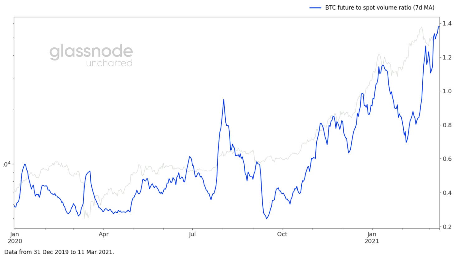
As binance noted on twitter recently, the amount of leverage traders are taking is insane. This means that we need to keep a close eye on funding rates as the attractiveness of shorting will increase. The higher the positive funding rates, the more the longs pay the shorts.

Funding rates seem to be both a curse and a cure right now.
They create friction on the way up, which at the same time causes a slower and more sustainable price rise.

The term spread also indicates that there is an expectation of higher prices in the near future, as we move further into contango between forward and near future contracts.

To be able to further understand the current market, we go back to analyzing the liquidity that is moving from long term holders to short term holders. Like this we can get a better understanding of the mechanisms and entities that are driving short term price behavior.
What is interesting to see is that on the last peak in January the sell pressure came from older holders, specifically from 3-7 year old addresses, implying that long term holders were profit taking and more importantly, that that same supply was transferred to short term holders.
For the more recent peak at $58k, ‘ASOL’ indicates a much lower average age of the spent outputs, proving that the supply came from younger entities.

The destruction of old supply highlighted above creates the new supply (now, 1w-1m old) highlighted below.
So since the peak in January, 40% of the short term supply is now held by entities that have been active between 1w-1m, making this investor cohort more relevant than ever to understand short to medium term price action.

We can also see the increase in short term holders through the large spike in new entities.

So as seen below, the first major supply transfer has happened, as indicated by the first red arrow. It is clear that after the first peak in January, the rate of transfer has slowed down (second red arrow)
Now it becomes important to monitor the slope, which indicates the transfer rate of this supply, and has indicated tops in past bull-runs.

From a structural perspective, we can see the impact of short term holders by dissecting the percentage composition of the ‘entity adjusted realized cap’ measure by its highly liquid, liquid & illiquid constituents. The ‘realized cap’ gives us the market capitalization of the network, based on the price that the currently moving bitcoins were last moved at.
This is an important measure, since it gives us an indication of the relative weight transactions made by short term holders have on the total network value.
When we compare the current cycle with 2017/2018, we have reached the peak 30% composition of highly liquid supply for the first time.
What is also important to note, is that we see an increase in the rate in which supply goes from liquid to highly liquid on the run-up to global tops (black arrows).
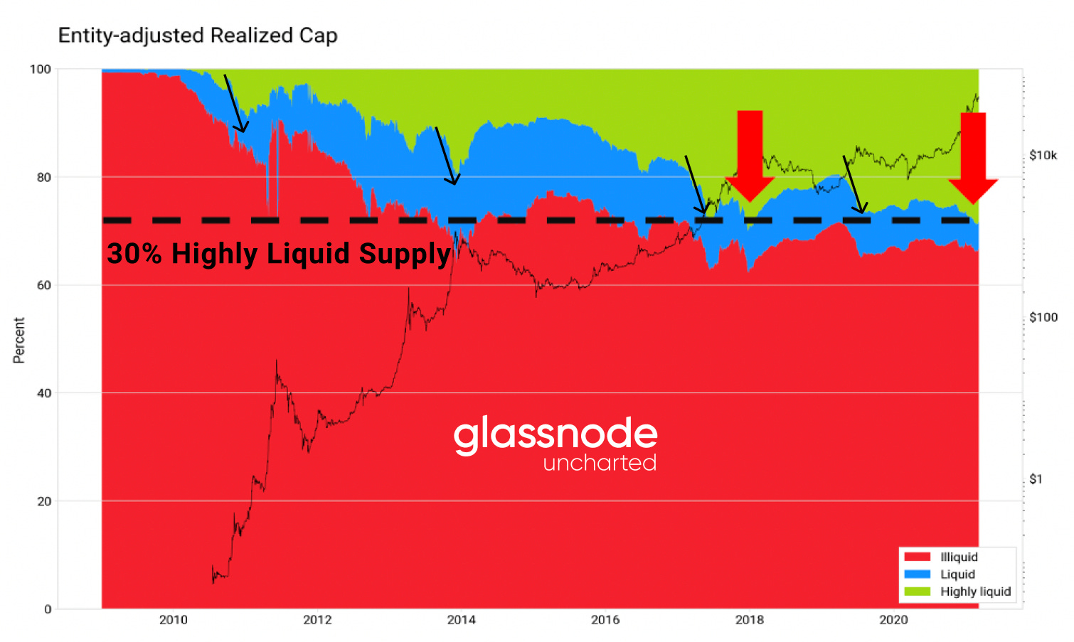
From the visual above two things become abundantly clear. The first is that highly liquid supply tends to increase in the ramp-up to bull markets, an effect seen since 2011, and the second is that there seems to be a strong floor created by the illiquid supply.
Although the highly liquid supply is important to look at when we approach a top, it is the movement of liquid supply that confirms that a local or global top is in.
To highlight this point we discretize the ‘adjusted SOPR’ metric by liquid and highly liquid supply below.

So now let’s combine all the aforementioned elements together into one comprehensive view.
We defined that short term holders, particularly between 1w-1m are becoming very important, and represent a large portion of the highly liquid supply. On the other hand, long term holders (in particular 1-3 years old) are mostly responsible for the liquid supply. Combined these are the two major market forces at work in this regime.
We also mentioned the importance of the ‘realized cap’, as it defines the cost basis that different market participants have, and in particular highlights their sensitivities to changes in price.
To get a wholistic macro picture, we can combine all of these elements into one metric called ‘RHODL’, which is a ratio between the short term holders (1w-1m) and the long term holders (1-2 years) normalized by the ‘realized cap’. This gives us an indication when we are entering an over extension of the cycle (red area on the chart below).
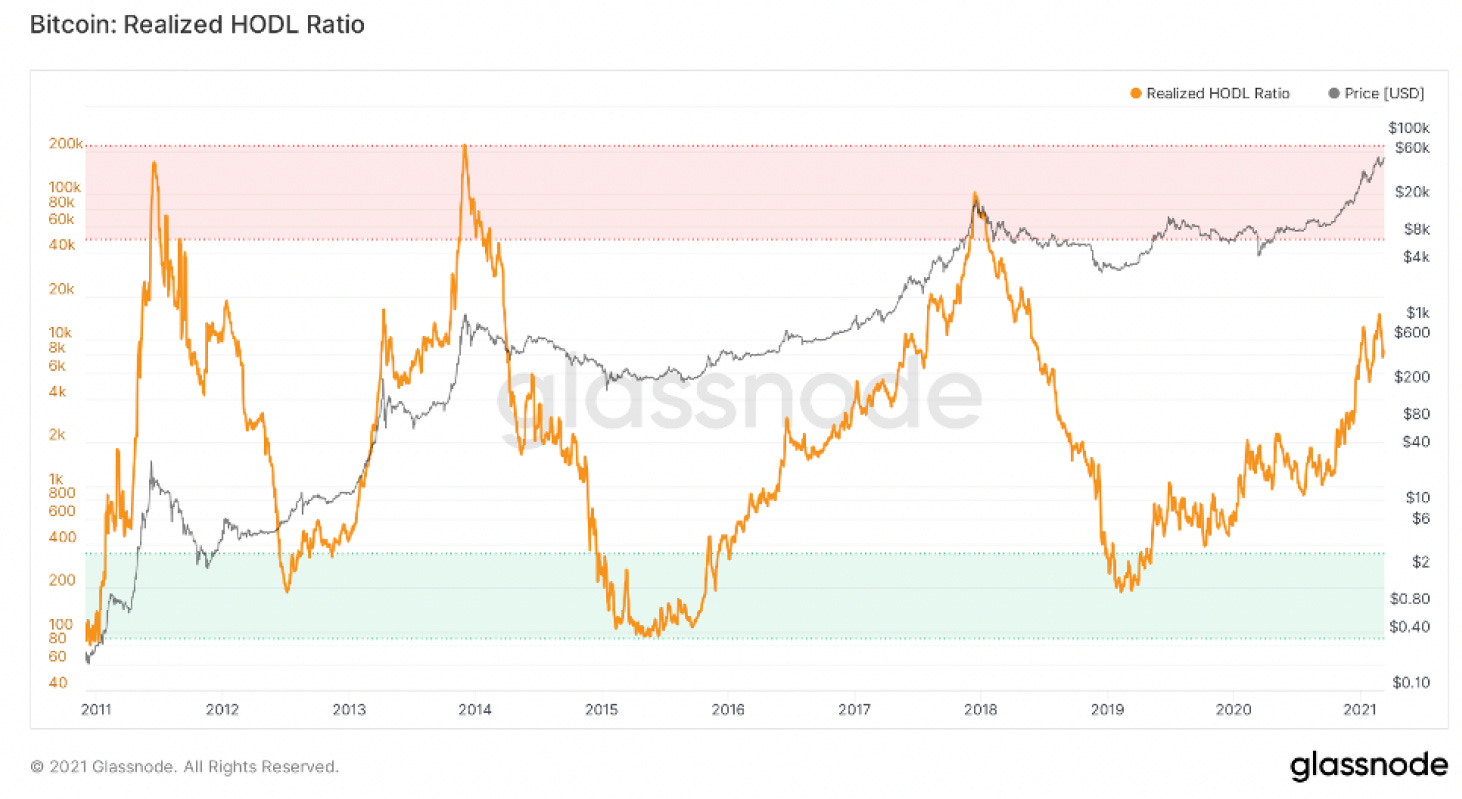
When you compare the structural patterns of the beginning of the last two bull markets, there seems to be a similar pattern that repeats.
We believe that we will see a combination between 2013 & 2017, meaning that we might reach a local top like in 2013 soon, that then sets us up for the global top at the end of 2021 beginning of 2022. In terms of the ‘Realized HODL Ratio’, we are not in the critical red area yet, but we are clearly accelerating like we did back in 2013.

This notion that we are not yet structurally over extended is further supported by the ‘Long Term Holder SOPR’, which indicates that we are at a level similar to the second peak in 2017, and that we are moving closer to a local top.

That being said, the potential correction will unlikely be as bad as in 2018.
Yesterday we saw the second largest daily supply lockup in over 3 years, which once again proves that many newcomers are in it for the long run and the eventual supply short squeeze is imminent.

Of course our arguments above are not taking into account exogenous black swan events like a major equities crash.
Since the global financial crash of march 2020, there has been a fundamental shift with regards to bitcoin as an asset class.
The intra day correlation between bitcoin and equities has changed on a structural level, due to the entrance of a new type of investor class. Since the beginning of 2021, the correlation has been rising again reminding us that bitcoin is not in an isolated bubble anymore, and will be effected by outside forces.

Looking at the 30d moving correlation to equities, it’s also clear that we are going back to those 2020 correlation levels.

For those of you that are interested, we will be deep diving more into these macro effects in a separate publication soon.
We wish you all a fantastic week.
Till next time!
- Jan&Yann (@Negentropic_)
Thanks a lot for this highly valuable post and all the knowledge you guys share with us every two weeks! One topic that I would like to hear a more detailed explanation on is why you expect a bull cycle with two parts similar to 2013 where we are in the last third of the move (top end of 2021) vs a bull cycle with one blow off top similar to 2017 (top mid 2021). Thanks again for your work - its much appreciated
Could you please cover next time why do you see 2 tops at this run? I do agree with some of commentators here. Amazing analysis , much appreciated. The point with 2 tops stays unclear for me. I do personally see us in somewhere like we were in September - October 2017 bull run. Thanks for all you do