Dear Glassnoders,
Thank you for your feedback and kind words for the previous reports, we are happy that you have enjoyed them so far.
This week we have a very thorough review planned for you. We will try to cover both the micro and macro structure of the market, by combining many unique insights on where we are in this bull cycle.
We will try to let the data guide you through the minefield of price discovery in this emerging asset class, that has now blown onto the world’s center stage.
We will start off by briefly covering some of our observations about the last couple of weeks as well as the current consolidation phase, and then dive into the ever more important structural dynamics that are unfolding as we speak.
As always, please shoot us any comments below or on twitter (@Negentropic_).
Now let’s dive in, we hope you enjoy this weekend read!
So let’s start off with the recent rally to new ATH’s, that seems to have been caused mainly by retail buyers.
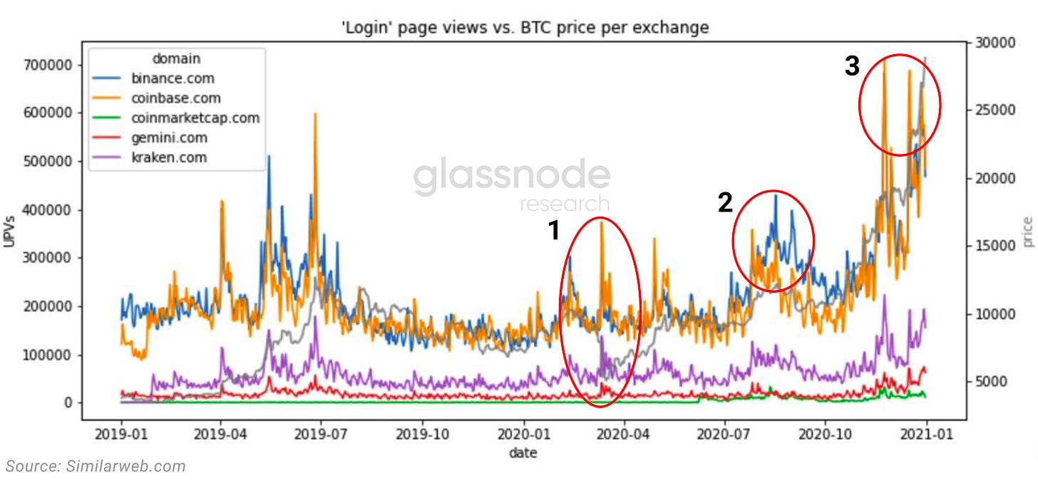
To determine this we analyzed the login and signup trends on the major exchanges.
What becomes clear is that when looking at logins (users with existing accounts), the first two major inflows of money where large whales and institutions, while the third price rise since early January was predominantly retail, a fact highlighted by the 5x more signups on Binance compared to Coinbase.
Furthermore, when comparing the two largest exchanges (Coinbase & Binance) it becomes clear that Binance has had a net increase in bitcoin holdings of 38% since March 2020, which accelerated further into early 2021.
Since the total supply on all exchanges has dropped by more than 800k bitcoin, the relative importance of Binance spot exposure has become more relevant as a whole.
Institutional demand for spot on the other hand seems to have flattened as prices rally. Grayscale has slowed their accumulation of bitcoins for the time being, and their premium has briefly fallen into the negative this week.
OTC volume has also flattened into 2021, when compared to the early and mid 2020 spikes in volume.
Even though spot demand has decreased, the overall institutional interest hasn’t gone away, as it has only shifted to the use of derivatives with leverage to trade the asset .
This together with an increase in retail volume has resulted in two spikes in early 2021, where the ratio of derivatives to spot volume has reached close to 1.2, meaning that there is more derivatives traded volume than spot.
And due to the fast rise in leverage within a short period of time, the market has pulled back viciously multiple times to liquidate short term overextended positions.
Generally, since mid December 2020, retail seems to be the main driver of the rally, whereas institutions are buying up the dips, creating the new support levels on the way up.
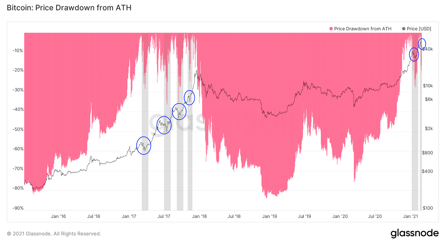
Currently, the short term consolidation is really healthy and increases the chances for a higher global top. As new purchases have a higher cost basis in a fomo environment, no one will sells at a loss.
This past week, tactical indicators such as ‘SOPR’ and ‘funding rates’ had the chance to cool off and reset, making room for the next leg up.
Interestingly, the CME gap has also been resetting during recent consolidations, another good indication that we have more headroom moving forward.
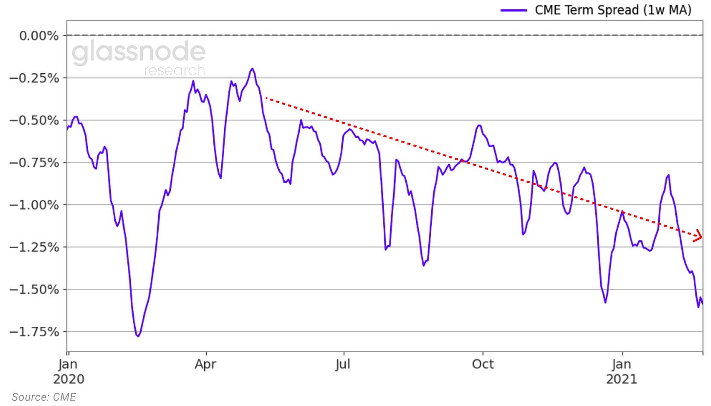
Expectations for the next couple of months seem to be quite high as the term spread is further accelerating into contango, as investors’ confidence for higher prices in the future rises.
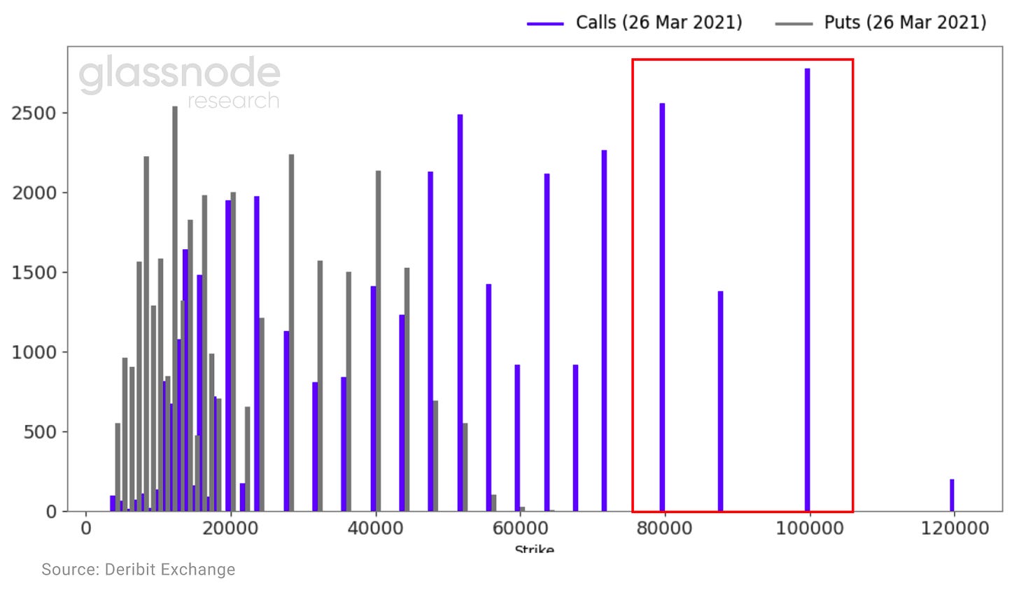
This higher expectation in prices, is further highlighted in the options open interest. As of February 24th there are 6k call options with strike prices between 80-100k.
This sets the stage for another leg up in bitcoin price in the next weeks, as the price rise in spot could start to accelerate due to a gamma squeeze, similar to what we saw in December 2020.
Now, diving further into it from a structural angle, the ‘Liquid Supply Change’ chart, one of Glassnode’s most powerful metrics, shows us that supply on the bitcoin blockchain is further drying up despite rising prices.
This has never happened before for such an extended period of time, and as mentioned many times before could lead to a massive supply squeeze soon.
Long term holders seem to be less worried about this pullback than the previous one from $42k down to $29k, as they are not reducing their positions nor taking profits as aggressively as in January.
More long term holders seem increasingly convinced that this is not the top yet and and start comparing these 30% corrections to those of previous bull cycles.
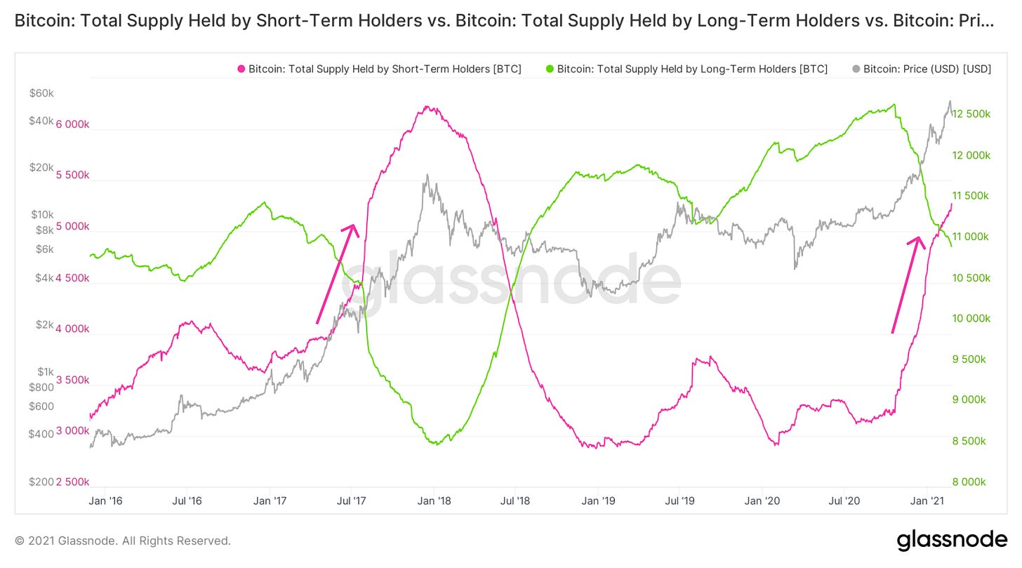
In Uncharted #3 we talked about the transition of supply from long term to short term holders at this point in the cycle.
However, this time short term holders are fundamentally different than in the 2017 bull run. Institutions that are accumulating strategic positions for the long run, will likely not be flooding the market with supply at the later stages this year. So in part, the new short term holders are also long term holders.
For all those that ask themselves who would possibly buy so many bitcoins at these price levels, its important to understand how these large firms function under the hood and manage risk. Counterintuitively, for many of them, a $40k bitcoin is more attractive than an unproven $8k bitcoin.
Now, the very big guys are coming in. On Wednesday this week, yet another mutual fund (Stoneridge) has filed with the SEC seeking to invest in bitcoin via put options on futures and pool investment vehicles.
Now it gets interesting. So on a macro structural level, where do we stand?
It’s trivial to understand that the net effect in a large supply reduction with increasing demand, results in a price increase. The price since March 2020 has gone up 10x, an unprecedented move that has pushed bitcoin over the Trillion dollar line. When you look at that in terms of the ‘S2F model’ it is clear that we have had a premature rise in price. This on a structural level seems to be following the 2013 rise more closely than 2017.
The current price action is not as extreme as 2013, but it is happening significantly faster than 2017. At the current rate we are 1-2 weeks ahead of schedule when looking at the ‘S2F model’ alone, indicating that the supply shortage effect and the demand effect are being underestimated by quite a bit.
Who and what is causing this rise? To understand that we need to look at the age composition of the bitcoin’s that are being moved on-chain. More concretely we need to look at how the short term bitcoin behavior on-chain (bitcoin held for 24hrs – 6 months) differs from that of longer term holders (bitcoin held for 1-5 years).
As seen in the ‘RC-HODL waves’, what becomes apparent is that the major tops are defined predominantly by short term bitcoin holders. On a macro level, whenever bitcoins that are 1month old or younger start to make up more than 60% of the realized cap, we are close to a major top in the cycle.
When looking closely at the bitcoin’s that have been moved last within a month or less, it becomes clear that towards the middle and end parts of the major macro cycle, we see three distinct tops. They are all slightly different from one another, but are three nonetheless every time.
To understand the significance of each peak we need to also include the impact that older bitcoin have on the realized cap. What becomes apparent is that towards the end of the cycle, once most of the on-chain activity that is driving price comes from short term bitcoin movements, all tokens that are above 6 months old make up a combined 6% or less of the total realized cap.
This indicates a structural extreme, and like an elastic band that is stretched to its limit, is not sustainable for long periods of time without a pullback. We currently stand at 20%, signifying that we still have room to move further up in price until we start seeing some strong structural resistance.
How do we know that we have reached the blowoff top, and not just a pause before the next move up?
To answer this we need to take a small detour into the mechanics of opportunity cost. It is important to understand how the network as a whole feels about the current price. In other words when are there more coin days being destroyed than created, resulting in market participants thinking that the opportunity cost, or the risk of holding the coin until tomorrow is too high, and as a consequence are willing to sell today at the current price. This concept is encapsulated in the ‘Reserve Risk metric’, which gives you this opportunity cost ratio of the entire market in visual form.
When looking historically whenever this metric surpassed the 0.02 level it signaled an unsustainable area. We are currently half way through the current bull cycle compared to 2017, and a third of the way when compared to 2013, if we assume the potential of two tops as discussed above.
In terms of defining the difference between a local and a global top, we need to refer back to market psychology. What we mean here concretely, is that we need to understand how human greed and fear are major forces that drive behavior.
This concept is well encapsulated in the ‘aSOPR metric’. In a bull market, most market participants will not sell below their buying price (indicated by the 1 line) as they expect higher prices in the future. It is only when fear of losses creep in, that market participants start disregarding future expectations and even short term losses as they flee to safety. Only then are we truly over with the cycle, an event that is defined clearly once aSOPR starts reaching 1.3 to 1.4, a phenomena that has held true for all historical bitcoin bull cycles.
So is the current bull cycle more like 2013 or 2017?
From a structural level we believe that we are in between, and that there will be characteristics of both cycles in the coming 12 months. What’s clear is that our technical and structural indicators are pointing to at least one more leg up before we start reaching the limits of the first part of this 2020/2021 bull cycle. We will keep a close eye on these metrics while Bitcoin and crypto cruise further into uncharted territories.
Till next time!
-Yann&Jan








Great article. Looks like there are two missing inputs to the price including 1) bitcoins locked up for lending and 2) the new Canadian ETF.
As an example, I read from PlanB that BlockFi has $20B Bitcoin locked up from retail and institutions who are earning 3-6% yield on their coins. That $20B is growing. There are other companies with lending like like HodlHodl, Abra, Gemini, etc.
I read the Canadian ETF is now worth $624M and growing. This should mean that this amount is getting locked up as well.
Hope this is helpful. Cheers.
These posts have made me subscribe to Glassnode. Fantastic analysis using fantastic charts. I agree with Bitcoin Daily below, The Grayscale premium has gone negative since better alternatives have recently been launched, Purpose and Evolve ETF's. Purpose is buying on Coinbase and Gemini. Ben Lilly's work "The Grayscale Effect" was tremendously powerful navigating the market. The GBTC shares are still unlocking and being sold (and seem to correlate with the negative premium), but the buying pressure on BTC Spot exchanges does not seem to be as strongly correlated as before. Where is this money going, and can we track it? Ki Young Ju suggests the Coinbase/Binance premium to track institutional buying pressure.